
Drafting an ultimately never-to be-published post for this blog recently, I found myself wanting a map of Paris.
Although I didn’t know exactly what type of map i wanted, I felt that, like the perfect house or perfect mate, one would recognise it when one saw it. Something with a visual dash, for sure. It would have a certain oh, I don’t know, a je n’est ce pas. I thought, (both tautologically, inaccurately, and pretentiously)
But Not some regular dull Google map type-map. Oh no. Rather it would be map of great style and elegance. A map that drank deep of ancient history, with a knowing and seductive style. A map that sipped patis and smoked Galois. Yes, with a look of sage, weary wisdom in the eyes, siting enigmatically, in some old, fin de siecle café. A map that reeked of elegance and style, of eclat and elan, of joi de vivre, and that ineffable, Parisian type of chic.
Sorry, where was I? Oh yes. Anyway, I did some web picture research, looking for the perfect Map. And here are some of the lovely things that turned up. They are offered up here, below, just in case it pleases you to see them.
I hope that you enjoy.

The maps above and below, are the earliest I found. The one above is Early Renaissance. 1422 to be exact. I love the way the original Roman city, on the Isle de Cite, even this date, still represents a sizable chunk of the city overall. (Not so today, more of a spot on the map really, even in central Paris) . Yet Paris, even by now in 1422, was already the largest, most populous, prosperous and intellectually important city in western Europe, home of the greatest university and centres of theology. London had yet to compete, Rome, capital of the Papal States, still diminished by its centuries-long decline. Madrid (or Moscow) didn’t even really exist. Nope, Paris ruled supreme.


This Map above is from significantly later. Nearly three hundred years later, from 1705. This is no longer a medieval city but a Renaissance city. In simple physical terms, you can also see how much Paris has swelled. After decades of aggressive expansion by Louis le Gran. (Louis XIV) France overall had also swelled. It was now definitely the dominant state in Europe, its boarders enlarged with territories, taken off nearly all its neighbours, including Spain and Italy. The land is rich, the aristocrats, the church, and merchants very rich, the theatre, literature, academies, its artisans, craftsmen and artists, all the best in Europe. And God, did they know it? The capital reflects this preeminence. And arrogance even? Mais bien sur. Et le state? Le state? C’est moi.
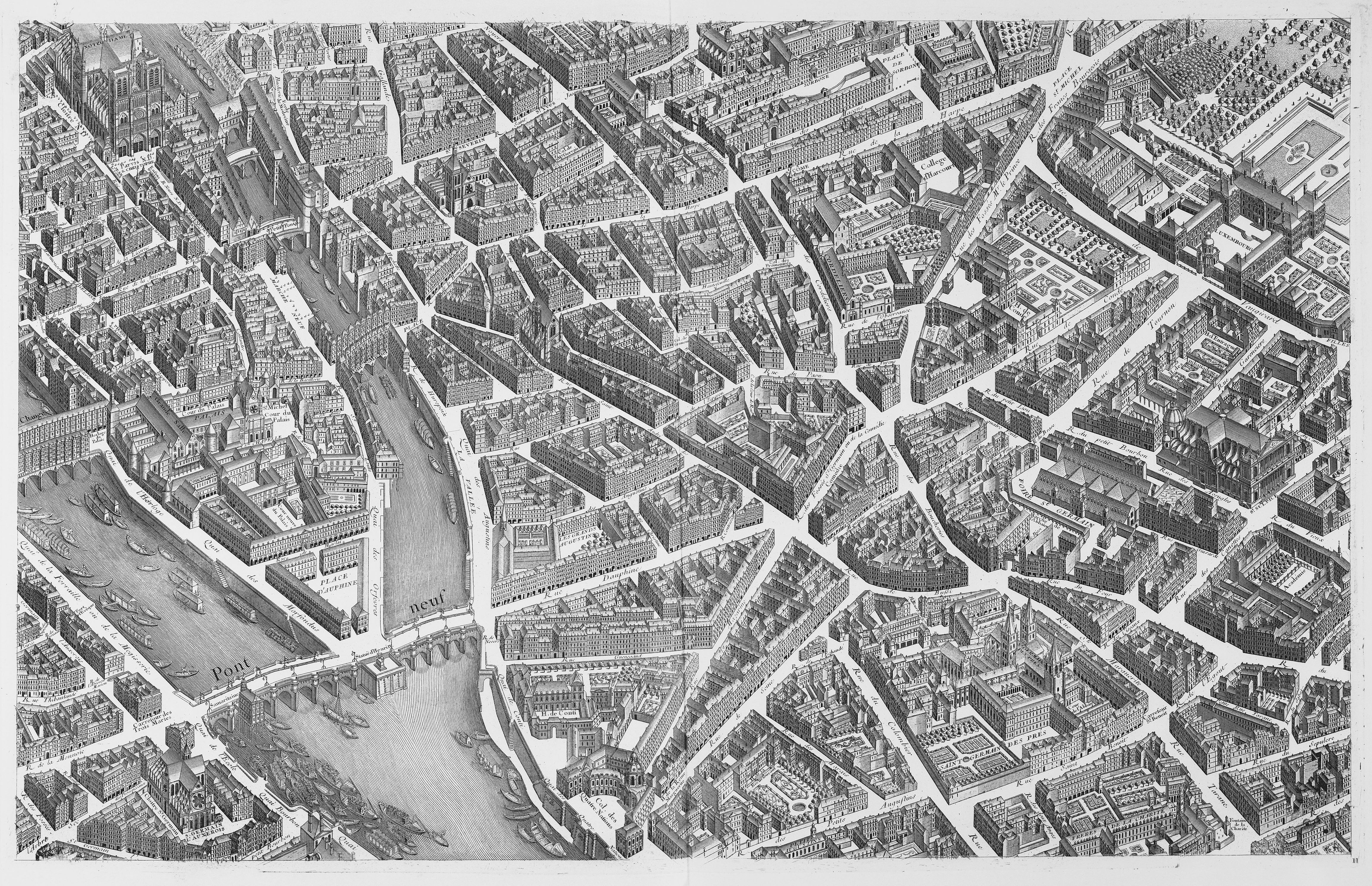
Well into modernity here. Paris after Haussmann. You can see much of the medieval fabric and street scape has gone, in come the wider avenues and streets. Still the centre, of a highly-centralized nation, and capital of a self-aggrandizing state, and now an overseas Empire to boot. This isn’t really a true map of course, it does not look “straight down” But (for exactly that reason) you have to love the 3-dimensionality of it.
Next..

I don’t have a date for this one above. On first glance you might guess 19th, even late 19th century, just because of the colours and the style of printing. But then look, lower left of the map, at the S and west part, and see how the Military school, ecole militaire” basically les Invilides area, (near where the Eiffel tower would also stand from 1878) is well outside the built-up central area. Surely this was no longer the case by the late 19th century? Or gosh, I don’t know, maybe it was the case. (Any French or Parisian reader here who would be kind enough to enlighten me?)
That’s all the historic maps i have for you today. But then, I thought, you might also enjoy these postcards below too. Because they’re all postcards that have some sort of ambition or pretension to be a map. In their more cheap and cheerful, lighthearted, democratic sort of way, they too, all mark the passing of the ages, and changes in economy, perception, in style and taste.
This map below for example, is anxious to be useful. It wants to be a postcard, yes, but it’s also hoping you buy it and start using it as a map. But has it made a fatal error? Is the text too small?

I will say one thing for this map above. It’s very good at showing you where the main rail lines and the main termini, the great railway station of Paris are located. Suspiciously good? Was it commissioned by the state railway SNCF?
I honestly don’t know, I found only this image on the web and have ever seen the obverse. But look at those huge orange-brown lines, (the railways) in both the North and in the South east of the city. Screaming about the railway lines and stations, non? Still, all in all, a jolly charming little postcard I thought, what? Also, if you wanted an overall images to know where the Parks were… Again, this postcard would be your only man.
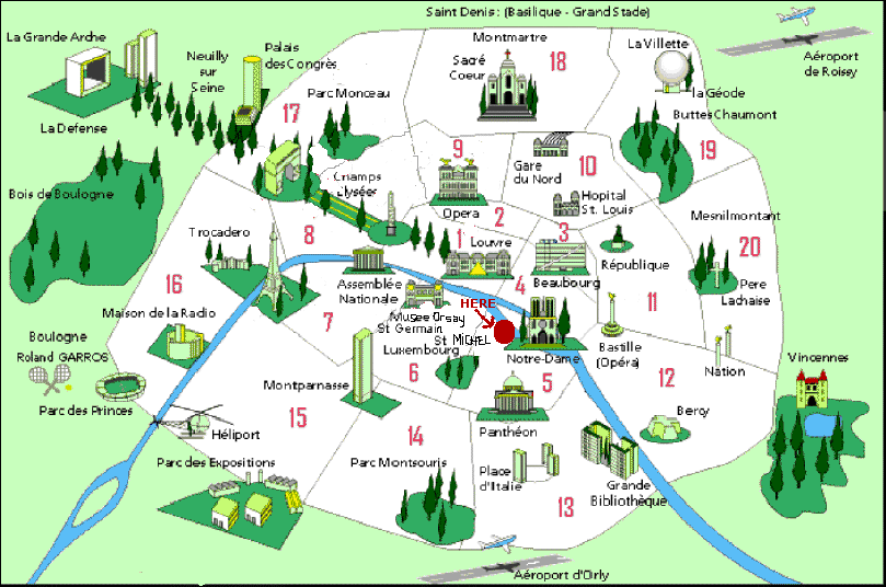
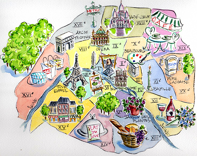
These next, these last few map-postcards, all highlight the 20 different arrondissements of Paris. Many also show the happy tourist the top sites, where he or she should go.

I particularly love this one above. As you’d expect, the classic sights: the Eiffel Tower, Montmartre and Notre Dame, all feature large. But there is also a notable pride in the modernity of Paris. Look at the tower of Monparnase. How many American tourists wold you think, from Chicago and New York say, would really want to go to Paris and visit a skyscraper? Pretty few i imagine. But the French just don’t care. They love the modern and the new, the French.
This postcard looks old. But yet, it features the Grand Bibliotéque National, which means it isn’t all that old. So the postcard itself, despite its love of the new, looks kind of dated. And that irony, is its great charm. Vive le France.
One more final thing about that image above. Look and find the little red spot in the centre, near Notre Dame. With just the word “Here” and an arrow. Do you think this post card was a complimentary gift, from a hotel in that area?
Okay, time for another. What about this one below? Cute or coy, kitsch or hideous? What do you think? The garish, sweetshop colours, and fake hand-painted water colour look are all bit much for me personally. But everyone is entitled to their own taste. The artist clearly has no interest in the south of the city, so he has just indulged himself in paintings of wine and food there instead Look at that bulging picnic hamper. This postcard was sponsored by the French marketing board of food and wine perhaps? Who knows?
Right, here’s another…

A crazy collection of images. Some landmarks need no introduction, but what is that glass tunnel lower right? (les Promenades Plantes?) Or for that matter, the building beside it?
and why is there a clock, handbag, and a pair off shoes in the frame? Why is there a jolly fat man, stuffing his face on grass, and why has he thrown his baguette to one side? (or is it tying to escape?) A postcard-map full of mystery, methinks.
Right, this one below is my favourite i think…

I like the completely slap dash way the whole thing has been casually tossed off, with a little skill but minimal fuss or effort. It took me a while to realise that black mess in the middle is the glass pyramid in the courtyard of the Lourve. Nonetheless, the notion of chic is what is being emphasized here, of effortless, Parisian style. Look at that lady walking her little dog, for heaven sake…

This one above is just trying to show you where the arrondissements are. Well, hardly “trying exactly” – it does it very clearly. Even tells you its doing it. A Bit dull though. A map-postcard of limited ambition. Rates strong on clarity though.
Not as strong as this one however….

You are most unlikely to be hazy on the layout of the arrondissements if you have this little item with you.
I like the 11th, 10th and 3rd arrondissements best myself, since you are ask.
That is pretty much it. Which map or card do you like best? Always delighted to hear from you.
For Dublin-based readers of this blog, a quick reminder we’re doing our next walk of the old centre soon, walking Dublin castle, tracing the lines of the old medieval city walls, and finding the previous, now invisible location of the walls, watchtowers and gate posts. As always we’ll be chatting and discussing, reading and decoding the city as we meander. if you are in Dublin that day, come and join us. All dates and details are on the Dublin Decoded website, here..
Thanks again for reading.
-Arran, at Dublin-(and sometimes Paris)-Decoded.
PS: added, on 29th September, 2014: from the wonderful, and ineffably stylish Paris blog, MessyNessyChic, of which i am a regular reader and big fan – found there today, on hand-drawn maps, by city residents who’d been asked to draw a map to (or of) somewhere precious to them personally. If you don’t already know MesseyNessyChic, I’m honoured to effect this little introduction.

Everyone needs a map of Paris and trip to Paris from time to time and even more urgent after reading this…
LikeLike
Could not agree with you more. We always need Paris.
LikeLike
I liked both the 15C map and the Paris-after-Haussmann aerial view. The first because it reminds me of other early historical maps of European cities, the second because of its simple 3D perspective (a style copied for several modern tourist plans eg Cambridge and Oxford).
LikeLike
I agree, the simple 3-D types are excellent. One sort of gets the best of both worlds, the sense of mass and volume of a very good sketch or architectural drawing , with the clarity and navigation benefits of a map. Yes, indeed, I’ve seen them in Oxford and Cambridge as you say. They are often aimed at visitors, and seem to work especially well in towns and cities of medium size. (they would never work for all of London or Paris, only a section) But they do work in central Dublin. There’s a wonderful map here of old, walled Dublin I use on my medieval tour here, with a less virtuosos, simpler, yet still very effective 3-D style.
LikeLike
Lovely post, Arran. I have a thing about maps too. Postcards seem to be going out of style now that you can send an instantaneous pic on your phone to whoever you want without having to queue up in the post office for a stamp. The map you were wondering about I’d say is very much pre-Haussman. The yellow overlay is where the main boulevards would be. Zola’s Paris already extends up the grands boulevards, pretty scabby housing, ripe for pulling down, but it was there nonetheless.
LikeLike
Thank you Jane, that’s brilliant, and very interesting. I suspected, and rather hoped, you might be able to help me out with that particular puzzle! And so it proved. 🙂 Thank you very much.
LikeLike
LOVE MAPS of all kinds if theyr are talking the SPACE. Paris as well as Leeuwaarden or other city.
LikeLike
The simpler the maps, the better for me.
LikeLike
Thanks Karina, and I agree with you about that. Simpler and more graphic the better, in general. Although one does see some very beautiful historic maps, with wonderful extraneous details. “Here be sea monsters” with a picture of the sea monster, and the like !
LikeLiked by 1 person
Yes, the artistic and ones with esoteric info would be an exception
LikeLiked by 1 person