Writing recently about the lovely old cast iron coal plates which adorn the Georgian and many Victorian districts of Dublin, I found my obsession spread from coal covers to utility covers also, such as gas, water, and the like. Yes, I know, I know what you are thinking. And it’s true, I have a very exciting life.
Anyway, these covers are often the only visible, surface sign of the extraordinary world under us, the crisscross of wires, tubes, tunnels and gas mains a few meters beneath our feet. It reminds us of the vast quantity of infrastructure a modern city needs. But from both a design perspective, and from a local history point of view, the covers have their own intrinsic interest too. Aesthetics matter, you might say.

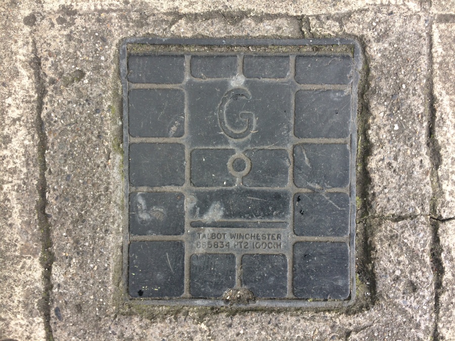
For example I developed a great affection for this scallop above, or at least this shell-shaped hinged cover above. It is for water of course. (For overseas readers, “uisce” is Irish for “water”) It’s a lovely design. Regrettably, the general, current trend is a tendency towards dullness. One can not possibly object to this similar- sized, though squarish Gas cover below. It is solid, well made, practical. That’s not bad. Not to be sniffed at at all. But it’s unlikely make you smile, or to increase the measure of happiness in your day.
But what about this one below, an improvement? Round again of course. Oddly enough despite the odd spelling of “Gaz” it seems to have a scallop symbol on it, a tiny one, right next to the serial number. Can you see it? Certainly looks like a scallop. Curious.

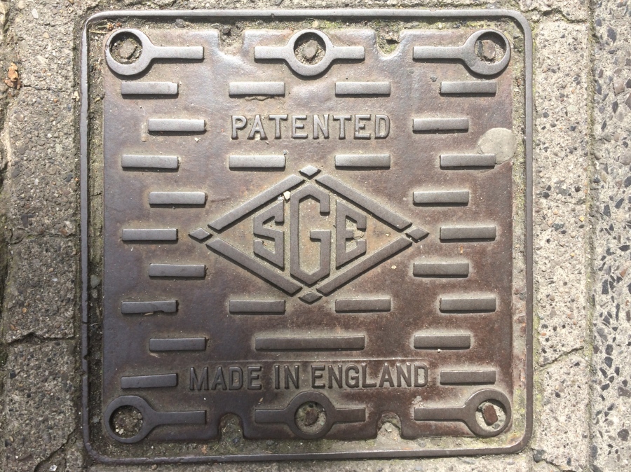
Or this one below? Also an improvement, no? Yes, despite the disappointingly foreign origin. It has a jazzy, modern energy to it. Industrial chic.
Energy matters in design, like it matters in utilities.
Elsewhere on Irish utility covers you can see the evolution of other utilities, from previously solid old state/ semi-state bodies, to now privatized corporate ownership. This old badge below, is on an manhole cover (over telephone wires) It has the badge of P&T post and telegraph, an old state body and carries the badge of the relavent ministry of the Irish state. The old Free State may have been a stodgy sort of place. But you can’t deny this has a certain vintage charm.
![]()
It’s even rendered in a typography that, for Irish people, is synonymous with the old “Free State” era and thus somehow nostalgic, even reassuring. Less nostalgic somehow is this logo below from the 1980s.
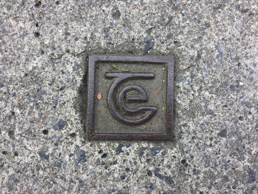
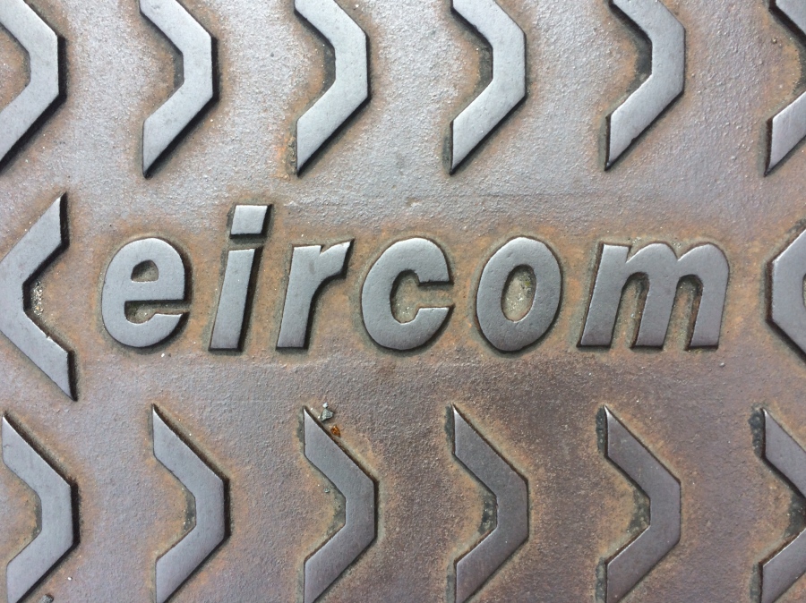
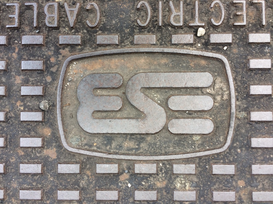
It is from the successor body, Telecom Eire. After Telecom Eire in turn came Eircom, which meant privatization and all the controversy that attended that process. So this logo below has even less charm. It seems stark, crude, and brutal.
Today of course we have moved on again. Telecom utilities covers now reflect the new and current economic reality of that sector, of the whole telecom industry. Vigorous and bewildering competition in the sector, with multiple broadband service providers, is matched by an equally manic and bewildering spaghetti of visual and textual information. It is a riot, a jumble, a smorgasbord out there, of competing high-speed, fibre optic broadband service providers, with their impossible-to -compare deals, their unreadable 10 -page T&Cs, the near impossibility of ever speaking to a human being and yet (when/if you ever do) the irksome, perky have-a- nice day ethos and, the way that once you finally manage to speak to a representative, any representative, the encounter will be instantly followed by a customer satisfaction survey. Oh God, the relentless customer surveys. My head hurts – just thinking about it.
i suppose utilities are always bound to be unpopular. Nobody enjoys paying bills, for one thing. Sometimes the reaction against particular utility, its ownership and its billing policy boil over to become a wider political issue.

Yet they seem intrinsically dull as well. Yet they matter. And just as technology marches on, and these are very technology heavy industries, so too does graphic design, and the spirit of each successive age which it always seems to embody. Whether that look seems stylish or leaden, bursting with modern chic, or dull as ditch water. Sometimes, its the attempts at re-branding, led by useless consultants at vast expense, that creates, rather than solves the problem. People, the public, the customers, are not stupid. They do not require everything to look “modern”
Uet lookimg at utility covers has its consolations. What about this oddity below, spotted on Baggot Street Lower. A cover installed by the sinister-sounding Anglo-American Oil Company.

Still, in partial mitigation, this is a finely made iron utility cover, in a poised, minimal style.
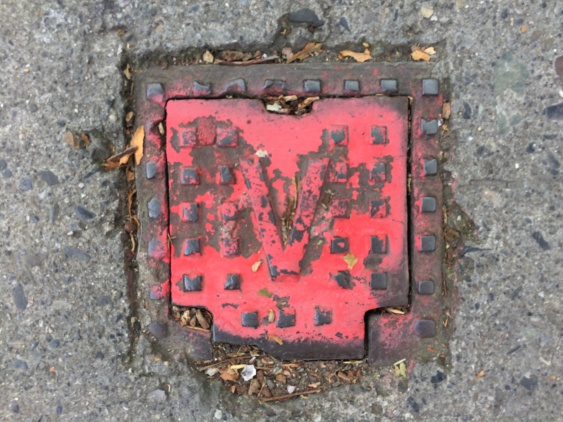
I harbour an affection for the strange and the different too however. The freaks and oddities. What about this manhole cover spotted at the junction of Pembroke St and Baggot St Lower? They speak of “Greening the city”. Does this count?

and occasionally what we could only call archaeology. What bizarre relic is this for example, reappearing up through the urban surface?
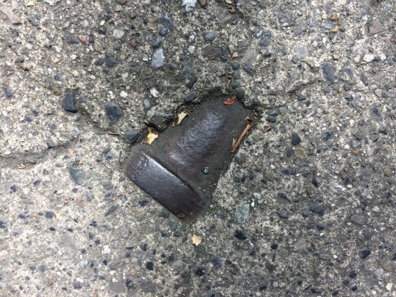
a bit like some of the venerable coal holes, mentioned in the other recent piece, some ironmongery occasionally goes missing…
![]()
But I’m going to leave you with this monster, encountered it on Adelaide Road, quite near the junction with Harcourt St. . It’s a man hole cover, cover what service or utility I know not.

But what a magnificent beast it is. check out the jaunty, 60s style design.

What I love about it the crazy jumble of information, like the maker and foundry marks; the quality and kite marks, technical information, even tips and directions on how to get it open. I presume the little span arch type “bridge” detail is the logo of the foundry, who seem to be Autostaele. They sound Italian, which would at least explain the superb sense of style. It reeks of class, like the PanAm logo, or a Saul Bass credit sequence, made for one of Hitchcock’s or Preminger’s 1960s thrillers.

The other thing i love about it is its -to my eyes at least, its slightly Swinging 60s style.

During the walking tours I lead, I often encourage guests to look up and around. (although not please note, while crossing the road) Recently I find there’s a lot of additional pleasure to be had, looking down and around too.
I can thoroughly recommend it.
Arran Henderson. August & September, 2017.

Hey Arran,
I believe the last manhole cover is of French design. The bridge is the Saint-Gobain logo (French multinational dating back to 1665) the NF means “Norme Francaise” and the other word is Autostable.
LikeLiked by 1 person
Ah ha, that is very interesting information Julien. Many thanks for sharing that, it is much appreciated. Very best wishes -Arran.
LikeLike
Arran you never fail to elicit a smile but this time you’ve excelled yourself! Thank you for that! Not only does it entertain but also sharpens my perception of the everyday utilitarian bits and pieces around us.
LikeLiked by 1 person
Many thanks Jean. Delighted you enjoyed it. Thanks very much for such kind words. I’m chuffed to bits!
LikeLike
Brilliant Arran. P&T always my favourite…have one near my house…”minding” it carefully.
LikeLike
Many thanks Mary. Thank you for the kind words. Delighted you enjoyed! -Arran.
LikeLike
Fascinating story. I do like this kind of descriptions and stories of a city or part of it. Inspiring.
I´m writing a guide to”read” “study” Dublin in big scale and in small scales for Danish students (16-19) years this website shows a lot of possibilities. Thanks
best regards kai rasmussen, Copenhagen, ex-teacher
LikeLiked by 1 person
My pleasure Kai. I’m very happy it is of some use to teachers like yourself, and to some of your students. Many thanks for your kind comments. -Arran.
LikeLike
Fascinating Arran – a niche interest no doubt but small landmarks in the evolution of old Dublin Town. Someone, in some foundry somewhere, was responsible for making each of the items pictured.
Your post took me back to my days as a boy auditor – one of our assignments was a foundry in Tipton in the Black Country. Ever since I’ve often glanced at manhole covers reading the inscription, and occasionally finding that company’s name.
LikeLiked by 1 person
Thanks very much Roy. Chuffed you enjoyed it. I also like the idea of your auditing trip from years ago, and of you still spotting that firms products around the place. Tiptons, eh? Next time i”m i UK I’ll probably start looking for them myself. Reading coal hole covers can easily become a sort of OCD behavior I find!
LikeLike
[…] It did really become a bit of an obsession of mine, May to August 2017, looking at them all, finding new designs every day. I even found after a few weeks that the obsession spread from classic coal covers over to include other iron covers, especially iron covers for utilities such as gas, water and the like. But I’ll deal with all that on another day! […]
LikeLike
There is one on the footpath south side of Beechwood Road, Ranelagh, bearing the initials W.S.C. Not Winston Spencer Churchill but Water Stop Cock (I guess).
LikeLiked by 1 person
Interesting article. The eircom lid has the Stanton Ironworks tread. A sort of open trapezium. Stanton made cast iron and ductile iron products including lids and pipes . They were taken over by St Gobain a French company and all production stopped at Ilkeston, Derbyshire and presumably transferred to France. You can still see the “Stanton” tread on PAM trademarked for St Gobain-Pont-a-Mousson.
LikeLiked by 1 person
Many thanks John, that’s very interesting. I appreciate it. Thanks for reading.
Arran.
LikeLike
I’ve totally enjoyed this piece, as I’ve been photographing manhole covers for some years, mostly in the US, but in Ireland where I’ve been twice. I was enchanted with the many small, beautiful designs of the water covers – lids? in Dublin. I always enjoy looking down! Nice to know someone else finds the beauty in the obscure or little noticed. Kathleen.
LikeLike
Thanks Kathleen, for your kind words.
I’m delighted you enjoyed the piece!
-Arran (Dublin Decoded Tours)
LikeLike